
When it comes to custom printed products, color matters more than most people realize—and understanding the difference between CMYK vs. RGB vs. Pantone can make all the difference. Whether you’re ordering parking permit hang tags, decals, student pick‑up backpack tags, credentials, or branded identification materials, the color system you choose directly impacts accuracy and consistency. RGB is designed for screens, while CMYK is used for full‑color printing, and Pantone provides precise, standardized color matching. Choosing the right approach ensures your final product looks professional, consistent, and instantly recognizable across every application
At Rydin, we work with organizations across business, education, healthcare, government, and facilities management—to assure that their brand colors print correctly. Understanding the difference between CMYK vs. RGB vs. Pantone helps ensure that printed materials meet expectations the first time.
This blog breaks down each color model in simple terms and explains how Rydin helps ensure accurate color output on every custom project.
One of the most common questions we hear in CMYK vs. RGB vs. Pantone is:
“Why doesn’t my printed color look exactly like it did on my screen?”
The answer lies in how color is created.
Because light and ink behave very differently, the same color value can look dramatically different depending on how it’s produced. That’s why understanding the difference in how color behaves within different mediums (screens vs print) is an important aspect when working on a print project.
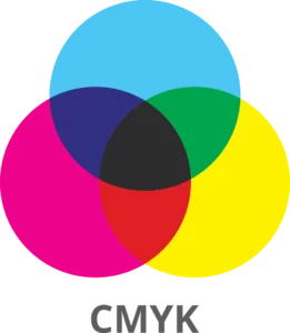
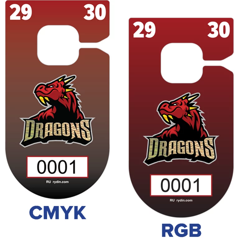
CMYK stands for Cyan, Magenta, Yellow, and Key (Black). This is the color model used for professional printing, including offset, screen, and digital printing.
This color model is a subtractive color model used in printing, where cyan, magenta, yellow, and black inks are layered on a substrate to absorb (subtract) light.
At Rydin, CMYK is used for most full‑color print projects such as:
Because CMYK reflects how ink actually behaves on paper or synthetic materials, it produces the most predictable printed results.
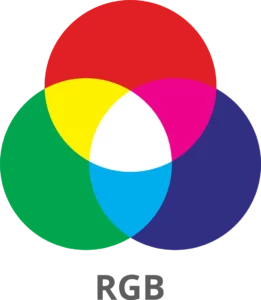
RGB stands for Red, Green, and Blue, and it’s used for anything viewed on a screen—websites, digital images sent for approval, presentations etc – essentially anything you interact with on a monitor, television, mobile phone or tablet.
It is an additive color model, meaning it creates color by adding light. When red, green, and blue light are combined at full intensity, the result is white. This allows screens to display very bright, vibrant colors that simply cannot be reproduced with ink.
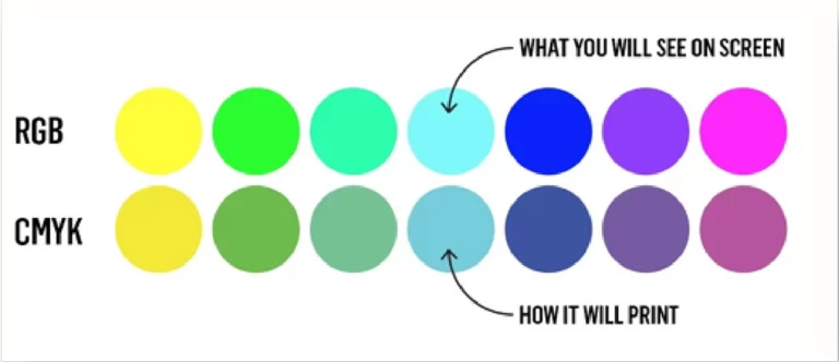
This is why colors that look bold on your monitor—especially blues, greens, and neon tones—can appear duller once printed.
Before production, Rydin’s art team carefully converts RGB artwork into CMYK to ensure the printed result matches your project and brand’s color requirements and aligns as closely as possible with your expectations
Color accuracy is especially important for Rydin customers because many of our products serve functional and compliance driven purposes, such as:
Using the correct color model helps prevent:
That’s why understanding color models upfront saves time—and ensures better outcomes.
For organizations that require strict brand consistency, Pantone colors offer an additional level of precision.
Color books published by Pantone demonstrate how certain colors are affected by different types of materials. For complete accuracy, matching the proper color and the selected material is a key aspect of planning a print project. Want to learn more? Check out the following Pantone video from Business Insider.
This color model is commonly used for:
Because Pantone colors are standardized, they remain consistent across different materials, printers, and production runs—making them ideal for organizations with established brand guidelines.
It’s important to understand that Pantone colors displayed on screens are only simulations. Screens cannot show true ink color. An accurate way to select a Pantone color is by referencing a printed Pantone guide.
In cases where a Pantone color must be reproduced using CMYK, Rydin using Pantone simulated colors to detemin the closest CMYK match- helpign set accurate expectation during proofing.
Color accuracy isn’t just about selecting the right model—it’s about expertise and communication throughout the production process.
Rydin’s art department:
Our team understands how color behaves across different materials (synthetic/paper), printing methods, and real‑world environments—ensuring your finished product looks right, functions correctly, and aligns with your brand standards.
When ordering custom products through rydin.com, color selection plays a key role. Whether you’re choosing from standard color options or submitting branded artwork, understanding how color translates from screen to print helps you make informed decisions.
If exact color matching is critical, providing Pantone values or approved brand references helps our team deliver the most accurate result possible.
Choosing the right color model ensures your printed materials look professional, consistent, and on‑brand.
At Rydin, we don’t just print—we guide you through the process, so your colors work as intended, every time.
If you have questions about CMYK vs. RGB vs. Pantone color selection or need help preparing your artwork, our team is here to help. Please send us a message.
CMYK is used for printing with ink, while RGB is used for screens and digital displays. Colors often look brighter in RGB than when printed.
Screens use light to create color, while printers use ink. Because ink can’t glow like light, some colors appear less vibrant in print.
CMYK is best for print projects. If artwork is submitted in RGB, Rydin will convert it to CMYK during production
RGB files are converted to CMYK, but some bright colors may shift. Rydin’s art team works to achieve the closest possible match.
Pantone colors are pre‑mixed, standardized spot colors used to ensure exact and consistent color matching.
Use Pantone when brand color accuracy is critical, such as logos, branded identification, or large repeat print runs.
Screens only show a simulation of Pantone colors. Printed Pantone guides provide the most accurate reference
Yes, but the result may look different. Pantone Bridge references help determine the closest CMYK match.
Rydin’s art department reviews, converts, and proofs colors to ensure the final printed product meets expectations.
Customers can select standard colors or submit branded artwork. Providing CMYK or Pantone values helps ensure accurate results.
No. Rydin’s team guides customers through color selection and preparation for print.FAQ thoughts – if used all need rewrite to Rydin voice/tone